


How to use our Button Designer
Insert a picture/image
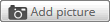
With one click you select your picture/image on your device which you want to place on the button.
Possible files formats are: .png, .jpg, .jpeg und .gif
Edit your picture/image
If you placed a picture in the designer you can edit it with several tools.
-
reduce and enlarge
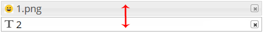
- There are two ways to resize your image. Just click on the magnifier icons or drag the image to your desired size using the small gray squares on the corners of your image.


-
to mirror
- You can mirror your image horizontal oder vertical.


-
to rotate
- With a click you can rotate the image by 45 degrees or you enter the exact value. You can also rotate the image with the green points in the preview.

-
change the opacity
- You can change the opacity so that the background shines through the image.

Insert text
This feature allows you to enter and configure text. You can add several text blocks. A line break is not possible! Just add as many text blocks as you need.
Design text
First you have to select a text line to use the different configuration tools.
-
Font Color
- Click on the black square icon to open the color palette and choose your prefered color.

-
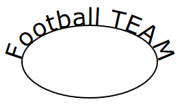
Curve text
- With this tool, you can curve your selected text line either at the upper or at the bottom border of the button. It align perfect to the shape of the button. After that it is still possible to change the size of the font or the color. This function is only available for round buttons.


-
Font type
- Click on "Font" to select a font that you like.

-
Font size
- The number shown is the size of the font. The higher the number the bigger is your text.

-
Italic
- With this icon you can change your text to Italic.

-
Rotate
- With a click on this icon your text will rotate 45° or you enter an exact number. Additionally you can use the green points in the preview to rotate your text.
-
Change text
- With the "change text" on the right side of your text element, you can complete or overwrite your old text.
Insert an icon or graphic parts
Within this menu we offer you some ready-to-use icons and graphics for your design. For example, you can find the "I love" symbol or other kinds of useful graphics to design your idea fast. These graphics can be placed somewhere you wish to. It‘s also possible to change the sizes of the graphics.
To draw
The "drawing" tool allows you to create shapes or to draw lines. Even coloring of your created shapes is possible. For this use the menu "stroke color" and "fill color".
Align text to an object or a line
First, create an object like a line, a free form or a circle. Now click on "align text on path" and enter your text. Immediately, your text is aligned to your coosen object. With this function you can design a lot of cool things. To make the line or object invisible, just select it and change the stroke to zero or the opacity to 0%. Or you can simply delete the object and the text will be left.
Select one of your created objects at the right-sided list. Now you can reposition the image or text with the shown cursor pad. Another way to move the element is holding down the mouse button and drag the element to where you want it.
move

Select one of your created objects at the right-sided list. Now you can reposition the image or text with the shown cursor pad. Another way to move the element is holding down the mouse button and drag the element to where you want it.
centering

By clicking the center of the cursor pad your selected element will be centered in the middle of the button.
align on border

With these control buttons, you can align your elements on the border or corner of the button. This is very helpful for angular formats.
define the order of the elements
You can set the order of your elements in the preview. You want the picture in the back and the font on the front? No matter, you can reorder the layers. By clicking and dragging with the mouse button pressed, you can move the selected object up or down in the layers. The top layer is the one that is visible at the very front of the button.
The background color of the whole button can be changed by opening the color table with a click on the grey squared icon named "background color".
You already has a printable and finished layout or file?
If you have a ready-to-print file, you do not need to use this button designer. Please use the order function here!
Colors
Important: color looks different on different devices or screens. The real 4 color print looks different to this preview on your screen and the preview is not a reference point for the colors. We print on calibrated high-quality print systems with professional color specifications. So you can be sure that we have an eye on print quality and the idea behind your layouts. If you need exact colors than please write us your details in the free field during the order.
Add to cart / Preview of your button
To get an exact preview of your finished layout just klick on the green button "Add to cart". You can do that as often as you want during your design progress. The red dashed line marks the border of the button. If you want the background color or other elements to go around the corner of the buttons, you can check the placement here. Please note the text on this preview screen. Once you put the design in the cart and go to the cart you can not edit the design again.
"Reference line" and "Template" buttons
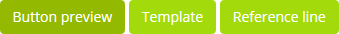
These two selectable views help you to place and assess your created layout. The red dotted reference line will appear when you click on the "reference line" button. This line marks the outermost edge within which text or important content should be placed to remain visible on the button. This red dotted line is just for your help. The printing area goes around the edge of the button. With a click on "template" you will see the complete print layout for the production. The inner black linie marks the border of the finished button.
"Rotate" field above the button designer

This function is only activated if you chose a rectangular format. With that you can choose a vertical or a horizontal view in the designer. With every click the view changes.

